Designing a home is an interesting process. Â There are so many ways it can develop. Â This is especially true on a large site. Â When there are few, if any restraints (such as setbacks or topography), you pretty much have a blank canvas to work with. Â With such leeway, in some ways it’s more challenging than it is when you have to stay within set parameters.
The preliminary design that we started with last summer had the look of three old farm buildings connected together with enclosed breezeways. Â It included a separate guest room above the garage and a home office separate from the main house. Â While it was an interesting style and the layout had great flow, it was over 3800 sf, which was far more than John and Julie wanted to take care of. Â It had the additional disadvantage of being somewhat complicated structurally. Â At a pivotal moment, we decided that it wasn’t the right direction for the house from a size and budget standpoint. Â It would suck up resources that had been earmarked for a barn and other farm infrastructure. Â However, if we could rework the floor plan into a smaller footprint with simpler construction requirements, we all felt we had a very good jumping off point for the next iteration.
Enter Chris Miller
Around about this this time, Chris Miller, joined Evolutn as a partner. Â The cool thing about Chris coming on board is that he had helped John and Julie with their kitchen remodel about ten years ago during our previous working relationship. Â This made it much easier to fill him in on the details since he was well-acquainted with John and Julie’s tastes and personalities. Â Soon, he and I got to work on revising the plans. Â Chris has been instrumental in helping transform the original design into something even better. Â We came up with a new concept that was based loosely on a contemporary farmhouse that John liked, but it still wasn’t quite what he was looking for.
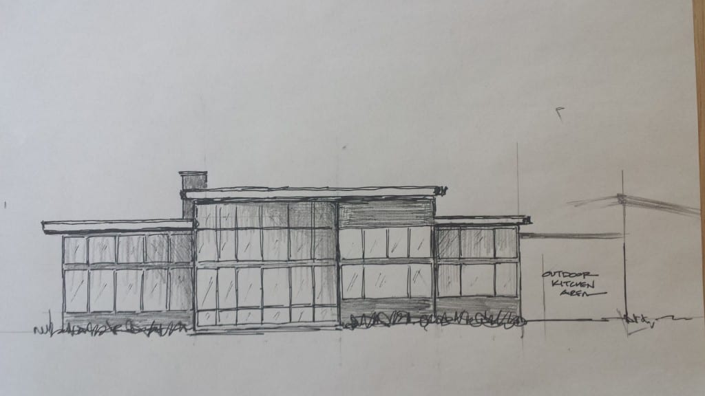
Next, we started thinking of a Northwest Contemporary design with a low pitched shed roof. Â This was something John had mentioned that he might like earlier in the design process. Â We were able to take the floor plan from the ag building inspired design and shape it into a very efficient new design concept. Â Having a really talented sketch artist like Chris at the ready is a real asset. Â He knocked this out over lunch one day:
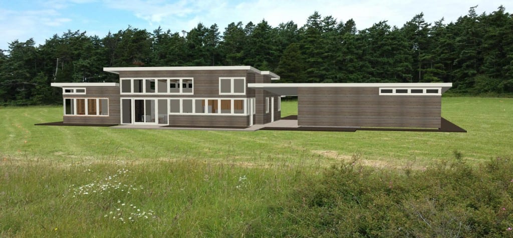
John and Julie really loved the new design. Â Looks like we have a winner. Â Introducing Project Homestead’s home design.
We plan to use plenty of natural materials to give it a warm feel. Â The colors in the rendering are preliminary, but there’s a good chance we’ll go with natural cedar for the siding.
Coming up next we’ll give you a sneak peak at the layout and talk about some interior details. Â To get an email with our next Project Homestead blog post subscribe in the bar to the right.


0 Comments